Increase Readership With Great Design

Fiona Hawkes
How can great design increase readership of your Annual Report?
When you hear the term ‘Annual Report,’ what do you picture? Pages of financials and long paragraphs? Are you falling asleep just thinking about it? While it’s a common legal requirement to publish an Annual Report, it is also a wonderful opportunity to inspire your audience, tell the story of your organization, and inspire your readers.
One of the reasons Annual Reports are such a unique piece is that they engage with a large audience, including stakeholders, customers, suppliers, leaders, and community members; that’s a lot of people reading one report! It’s a great chance to welcome your audience on a tour of your organization, show off a little, and take a look behind the scenes to enrich your organization’s story.
So what exactly is the role of an Annual Report?
Supports investor relations
An Annual Report provides a snapshot of successes from the past year (and perhaps longer for ongoing projects) and gives important technical information to stakeholders.
Builds your brand
Shares with your audience the culture of your organization and stories they might not get from other marketing materials.
Showcases your vision, people and performance
Highlights your organization’s values, provides an overview of your company, and shares performance metrics from set goals.
Tells the story of your organization
The report is 100% about your organization, it shares the story from a personal perspective, and highlights successes and achievements.
Enhances pride in your organization and brand
Sharing stories and accomplishments is important not only for supporting investor relations but employee morale as well.
Why is great design and strategy so important for an Annual Report? It is possible to meet all the content requirements, but without engaging and thoughtful design, information can get lost and act as a deterrent for readership.
So what makes a great Annual Report? What is going to connect with readers? And, how will it best provide value to your diverse audience?
Have a singular theme and clear message
Your report should have a cohesive look and feel and should be consistent in messaging. Readers have a limited attention span, so it’s important to get their attention quickly without unnecessary amounts of copy and without getting too technical.
Connect goals to performance through compelling storytelling
Demonstrate to the reader how goals set by the organization were met. This can be done with the help of infographics as well as dividing sections into organized segments.
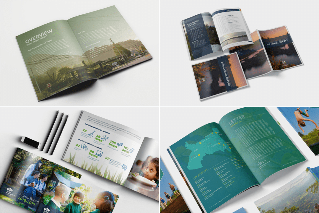
Bring the story out visually through design
Thoughtful content placement, engaging side bars, and incorporation of colour, shape, and illustration can help to tell your story while keeping your reader engaged. The way copy is sized as well as how it’s placed on the page all contribute to your reader’s experience.
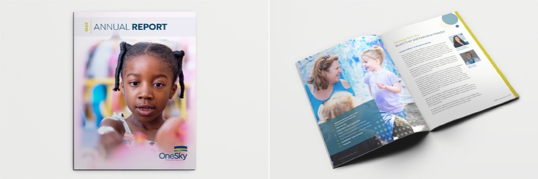
Use compelling photography
Excellent photography is a game changer for making your annual report shine. Photos give the reader a real snapshot of your organization and have the ability to convey your message much quicker than a paragraph of text. It’s important when incorporating photography to have a consistent shooting style as it’s another layer of your brand’s identity.
Icons to represent larger ideas
The use of icons is a great way to tie a visual to a particular message or theme. For example, if you are representing “Community” in a section of your report, using an icon such as a group of people will help your reader connect to the messaging on another level. That way when it is repeated in other sections of the report, readers will have made that visual association already and understand what is being referenced.
Concise, well-organized, and scannable information
Be sure to keep long paragraphs to a minimum when not integral to telling your story. Readers are far more likely to engage with content when it’s presented in smaller, more digestible chunks. For example, a visual representation of data using a pie chart rather than a sentence of statistics will be much more enjoyable to read.
By this point I will assume you are sold on how great design can impact readership of your annual report but perhaps you are an overachiever. Here are a few trends happening that are a step up from the traditional annual report formats.
Digital formats that are designed for great online user experience
Whether it be an interactive pdf or a microsite, these reports are designed to be viewed on screen rather than print. They have been carefully planned based on how the reader is going to interact with the information, creating a seamless user experience.
Interactive elements such as animated charts and video
These added touches provide another layer in telling your organization’s story.
Effortless, web-like navigation
In some instances, companies choose to create a microsite for their report that includes elements that are downloadable or printable, providing both on- and off-screen experiences.
Analytics tracking
One of the perks of creating an online annual report is the ability to track what your user is interacting with. This can provide great insight into what your reader finds valuable and could help to provide direction for future initiatives.
Whether you choose to be innovative with some of these design trends or stick to a more traditional report layout, ensuring you have great design and thoughtful, considered content will help your organization shine and provide an exceptional resource for stakeholders and readers.


Say hello.
Connect
info@taiji.ca
250.483.4143 or 250.597.2558
Content
About
People
Work
News & Views
Contact
Follow
Stay current
Sign up for News & Views